The 15 Worst Wrestling T-Shirts Of All Time
We may receive a commission on purchases made from links.
There is no shortage of wrestling merchandise out there in the world. Whether you're talking wrestling figures, championship belts, armbands, pictures, books, posters, necklaces, creepy dolls, or t-shirts, supporting your favorite wrestler can take a variety of forms. Fans from all walks of life line up for the merch table — at events for WWE, AEW, or your local independent promotions — like a swarm of bees heading into the hive yearning for honey. With their hard-earned money spent, fans usually walk away carrying their choice of well-conceived, creative, and artistically interesting stuff, but not always.
For every John Cena armband, there is a laughable Roman Reigns wrist contraption to help more accurately mimic his Superman Punch. For every Rey Mysterio mask, there is an Enzo Amore "Certified G" wig headband (yes, that was a real thing). You can purchase the Attitude Era WWE Championship Title, but also a grotesque special edition Fiend-themed WWE Universal Championship that is basically just the character's face on a title belt. However, there are few things more egregious when it comes to poor wrestling merchandise than horrendously designed t-shirts.
There have been a number of classic wrestling shirts over the years: the NWO, Austin 3:16, CM Punk's "Best in the World," DX, Bullet Club, and plenty of others. There have also been far too many travesties, and that's what we're here for — the 15 worst wrestling t-shirts of all time.
Daddy Eats First - Cody Rhodes
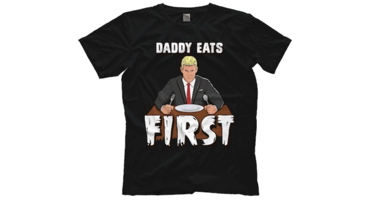
This is a piece of merchandise that you simply cannot unsee once it has been imprinted on your pupils. Daddy Eats First? Is this some kind of mean joke? What does that even mean? Cody Rhodes typically has a good eye for merchandise. He shouldn't go tattooing their designs on his body anymore, but at least we can say the American Nightmare logo (and neck tattoo) served as the root for a number of cool shirts throughout his time in AEW and now for his current run in the WWE.
Where to even begin with all the things wrong with this particular shirt? We can start with the simple fact that Rhodes never used "Daddy eats first" as a catchphrase anywhere ever. In fact, it's about as far away from connecting with his carefully crafted American Nightmare persona as one could get. Is it some kind of weird play on being a Dad? Maybe, but even if that's the case, it's silly and illogical. Shouldn't his kid be eating first? Not to mention that this shirt is ugly as sin, too. The cartoonish Cody is super simple in its resemblance and the block letters are just kind of there.
This is far from Cody's best and nowhere near AEW's best either.
Damn Right I Did - Earl Hebner
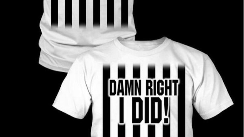
The wrestling world can thank Impact Wrestling for this little gem. There is a line, and this shirt crossed it!
Why in the world are we making referee shirts? That's the first of many problems here. Referees are not who the fans pay to see. Talented? Of course, but they are the men and women enforcing the rules of wrestling right down the middle. They are calling it like they see it. They are maintaining some semblance of fairness inside the squared circle. Pushing referee shirts — in this case, Earl Hebner's — down the throats of fans is a carny gimmick at best but also ruins product credibility given the impartial standing referees should have.
As for the look, they may have been trying for zebra stripes, but it looks more like the bars of a jail cell. Worst of all, the "Damn right I did" just raises memories of Jack Nicholson in "A Few Good Men," getting you thinking more about Rob Reiner courtroom dramas that also star Tom Cruise than professional wrestling.
Impact Wrestling merchandise never quite gets any attention in the wrestling shirt marketplace; perhaps this product deserves a large chunk of the blame for that.
Jo Mo Sapien - John Morrison
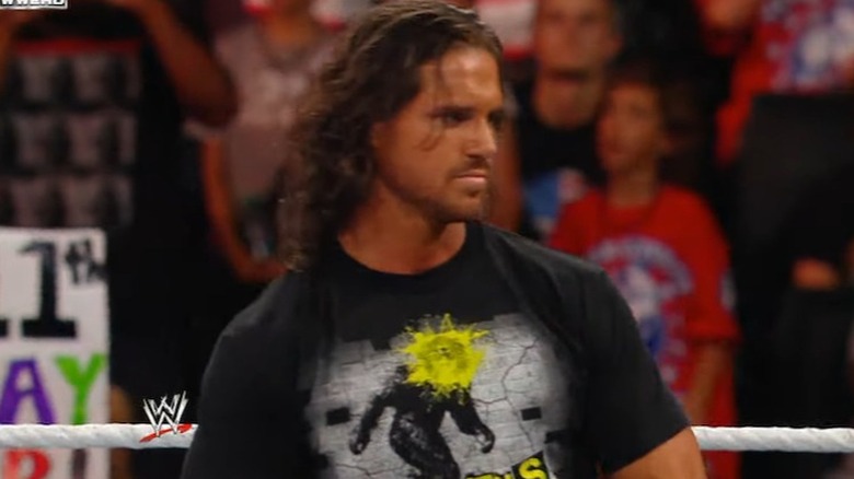
John Morrison should always have cool merchandise. He just presents as a pretty cool guy. He's the fashion-forward guy with a big puffy coat and a slow-motion entrance. But instead of the flare, confidence, and pizazz that Morrison has put forth over the years, this shirt stemmed from a Bigfoot and monkey reference: Jo Mo Sapiens.
This is bad on multiple levels. Jo Mo Sapien was not something Morrison ever used or leaned into throughout his career, and, because of such inconsistency, this is just jarring. Even if Morrison did somehow get the Jo Mo Sapien idea over, the shirt is an abomination of an attempt at doing something creative. Morrison's face plastered on Bigfoot's body looks like a three-year-old found some art supplies to play with and got right to work. The neon is bothersome, and the other monkeys on the shirt further double down on an obvious mistake.
To top off all the awfulness, the back of the shirt reads "We're gonna eat your lunch." As in, the Jo Mo Sapiens will eat your lunch — the monkeys, Bigfoot, apparently John Morrison, too.
Spit or Swallow - Carlito
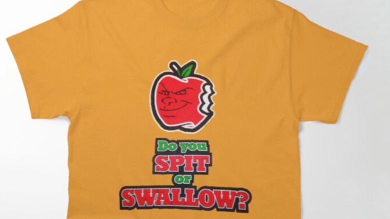
Is there anything more desperate than this shirt? Carlito wore this shirt at the very back end of the WWE Attitude Era, so it surely hasn't aged well, but this concept was bad even then. WWE simply tried too hard here. In case you forgot, Carlito would chew up an apple and then spit it in the face of his opponents. It was a unique schtick that got heat as a heel and cheers as a babyface.
"Spit or swallow" is an obvious attempt at shock value via sexual innuendo. While it'd be considered a poor juvenile joke in the freshman high school locker room, it is even less suitable as attire for a grown adult who should know better. The color is fresh with the orange standing out in a major way, so at least it has that going for it, but those words sitting front and center quickly detract from even the slightest positive this shirt could generate.
The bottom line: Trying to be risqué in such a way is generally not a good idea and comes across as immature; this t-shirt is Exhibit A as to why that is.
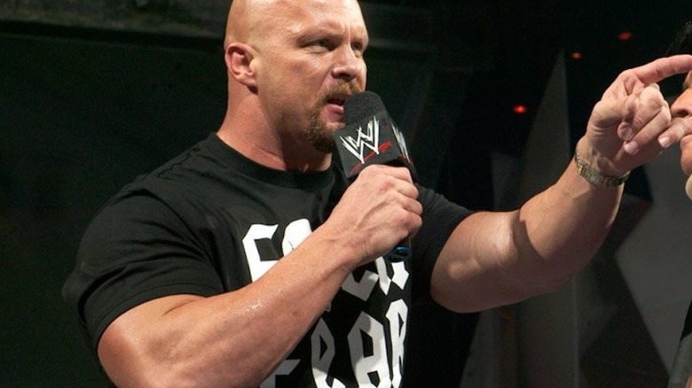
F**k Fear, Drink Beer - Stone Cold Steve Austin
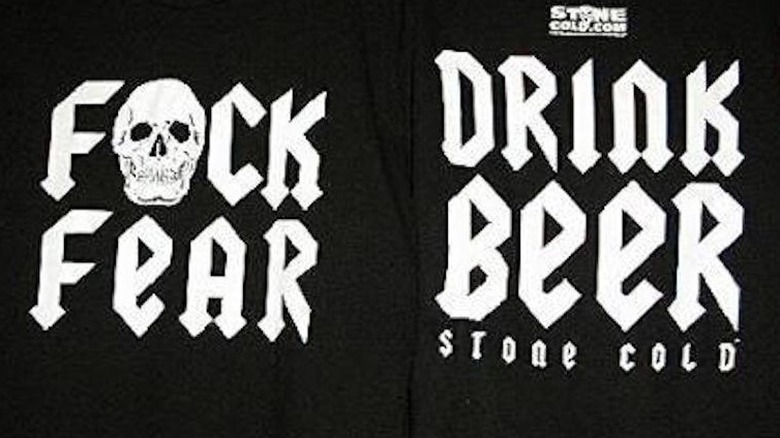
"Stone Cold" Steve Austin had arguably the greatest wrestling shirt in history – Austin 3:16 across the front, a giant skull on the back. It was simple, to the point, and compelling. We cannot say the same for this "F**k Fear, Drink Beer" shirt though. From a design perspective, it's aiming to be an ode to the Austin 3:16 look. But it's as if WWE was desperate to find a word that rhymes with "beer," thought about it for 11 whole seconds, arrived at "fear," and then wrapped the meeting.
"F**k Fear" doesn't even have any meaning behind it in the world of "Stone Cold" Steve Austin. It's out of left field, incredibly bizarre, and filled with sad desperation to be something edgy. Austin was a big enough star to get this product over, but it's hardly something that stands the test of time in Austin merchandise lore whatsoever.
$9.99 WWE Network

This is a disgrace. Let's hope that the number of people that bought this can be counted on less than one hand. Leave it to a major corporation like WWE to charge its fans for essentially a billboard about their new streaming service that they then want additional money for from the same loyal audience. Madness!
In addition to the flawed concept, this piece lacks any semblance of creativity, thought, intrigue, or time. The WWE Network being $9.99 is obviously the idea, but no flash at all? Not even a graphic or picture on the front? If there was ever a time to include a random theme like Bigfoot out of nowhere, this was it.
Anyone wondering when the WWE and Peacock shirt will be released? Maybe a Fox and WWE collaboration with the time slot for "SmackDown" on the front? If that sounds ridiculous to you, good, but that's essentially what this glorious disaster of a shirt is. Shame on you, WWE.
Faith for the Fallen - Karrion Kross
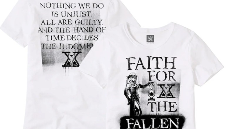
This just may be the "War and Peace" of professional wrestling t-shirts. Nobody wants to read a paragraph on a shirt to understand just what in the heck it means. The look and tone fit Karrion Kross' identity perfectly, but you shouldn't take that as a ringing endorsement. Kross has come across as confusing and over the top during his time in WWE while lacking any real definition. WWE certainly should get some credit then for creating a shirt that mirrors that perplexity. Congrats?
The black on white is easy on the eyes and the little Karrion Kross hourglass logo sticks out in a good way, so register the wins where you can. But that is all overshadowed by the nonsensical phrasing on the front and back that seemingly needs some kind of code breaker to fully understand. The Scarlett likeness on the front doesn't really match the rest of the shirt either, leaving you with a busy product that's too all over the place to resonate in an impactful way. Tick tock.
We The People - Jack Swagger
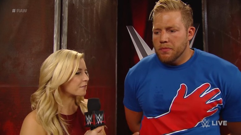
Jack Swagger's "We The People" bit caught on for a hot second during his time alongside Zeb Colter in WWE, but never enough for the words to appear on their own shirt. Swagger's hand over his heart while uttering the phrase though? Somehow that alone warranted a shirt.
What are we looking at here? It's just a big red hand on a blue shirt. That's it. How many creative minds in WWE were needed to come up with this idea? This is overly simplistic — in a bad way — and tries way too hard to be something it isn't. The red, white, and blue color scheme matches what Swagger was all about at the time, but the white is trivialized due to overwhelming amount of red and blue that the connection to Swagger's motto gets easily lost and forgotten.
Again, this shirt shouldn't have been a thing to begin with, but, if you're dead set on pushing this forward as something people might potentially buy, then aiming for a look much more pleasing to the eye was a must. Swing and a miss!
Pin me Wardaddy - Wardlow
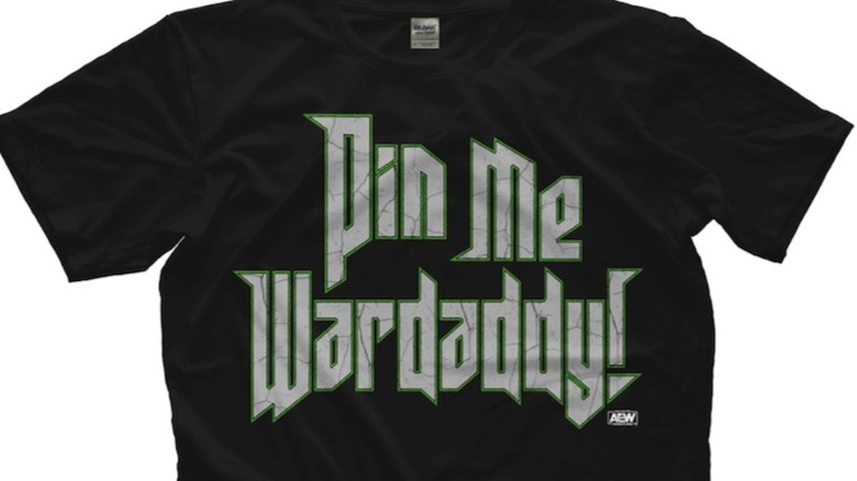
Now, is this a proper shirt for AEW's signature destructive force? Fans learned to embrace Wardlow over time after witnessing him decimating countless opponents with repeated powerbombs, and then they're expected to wear a shirt like this?
Logic would dictate that a Wardlow shirt should feature the powerbomb in some fashion or reference a symphony of some kind due to the very nature of his powerbomb delivery method. Know what else could have worked? Maybe just putting his name on the shirt, highlighting the "Wardlow" chants that ring out every time he shows up.
But no, it's "Pin me, Wardaddy" that we all got instead. It's a major misfire in both tone and meaning for someone regarded as a future cornerstone of the company. Wardlow has that "It" factor about him that fans have connected with since he served as MJF's protector early in AEW's existence. This shirt doesn't necessarily hurt that perception, but it doesn't help at all either.
Wardlow will hopefully be around AEW long enough to see a lot more shirts come his way. Let's hope this one becomes a distant and forgotten memory sooner rather than later.
Minnesota Nice, Colder Than Ice - Top Flight
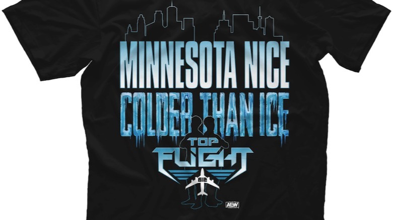
This shirt for AEW's Top Flight tag team may as well just say "lame" on the front, back, side, and each sleeve. If there was ever a time for some awesome ridiculousness, it should be for a team like Top Flight, but this is not that.
This is one of the most exciting tag teams in all of AEW. Daunte and Darius Martin are young high flyers filled with a ton of energy. There is nothing energetic about this shirt, as it literally puts the freeze on anything even remotely close. The blue colors do not match the vibe of Top Flight with the team's fans. That team often gets red hot. This is ice cold.
Even worse though is that "Minnesota Nice, Colder Than Ice" phrasing. If that's the best the AEW merch machine can pump out, then yikes! Being Minnesota nice — which basically amounts to passive-aggressiveness — isn't something these two talents are built on. But even if that was a personality trait you wanted them to embrace more, that should hardly be emphasized as a part of their core when there are much more impactful elements around the team you could feature.
Wanna Bee Jericho - Chris Jericho
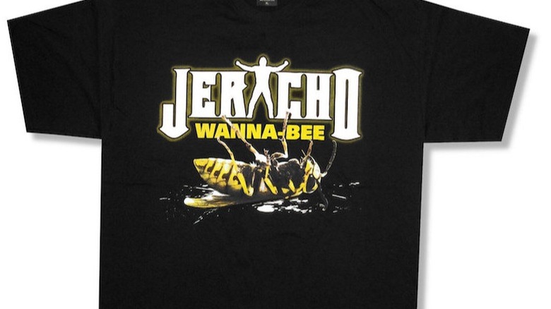
When you think of Chris Jericho, of course the first thing that comes to mind is a bumblebee. Throughout his career, Jericho has been a beacon of creativity as a professional wrestler. The guy is known for reinventing himself countless times ahead of any warning signs his current persona could be turning stale, so it's truly stunning to see such a ghastly piece of merchandise with his name on it.
Let's start with the bumblebee. Why a bumblebee? Why a dead bumblebee? And, is that even a bumblebee, because it bears a striking resemblance to a wasp? Jericho has had many character iterations, even early in his career, when this shirt graced the world's presence. Bumblebees, nor any other animals nor insects in general, have never been anywhere those versions of him.
Moving on to the "wanna-bee" phrasing: Get it? You want to be like Chris Jericho, but, since there is a bee on the shirt, the "be" is changed to "bee." Hooray for a terrible pun. If you're rolling your eyes, cheers to you. This contains epic levels of creative laziness. Period. End of story.
Old Man - The Undertaker
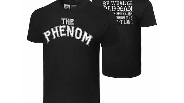
Can you spot it? There is a massive typo on this already subpar t-shirt for the legendary Undertaker. We'll get back to that typo in a second, but first: Calling The Undertaker an old man on his own shirt is counterproductive. The Undertaker is old. We already know that, but he hardly fits the definition of an old man, unless we're being as literal as possible here. More importantly, though, it's hard to stomach the idea of a "Phenom" like The Undertaker being promoted as an old man, so don't draw attention to it. This shirt does.
As for the aforementioned typo, "Be weary" kicks off the words on the back of the shirt, but it's certainly not what WWE meant to say. Per the Merriam-Webster Dictionar, weary means "exhausted in strength, endurance, vigor, or freshness." They meant to "be wary," which means "marked by keen caution, cunning, and watchfulness especially in detecting and escaping danger."
That second definition would better apply to what this shirt is aiming for. It's a hilarious misstep given the company doubtfully wanted to connect an old man with his tiredness. The Undertaker hasn't been known for good merchandise throughout the years, and this is a good example of why.
Ugly, ugly, ugly - AJ Styles
TNA did a lot of things wrong throughout the years, but this takes the cake. AJ Styles thinks so, too. When a fan brought up this shirt on Twitter, Styles responded, "I wish I could tell u this was the worst thing TNA has ever come up with."
Basically, the shirt is pure ugliness, and, for a piece of apparel that just says AJ Styles' name, that is incredibly problematic. Even being able to decipher what it says is quite a chore. Reading the back to determine that is like trying to find a sailboat in one of those Magic Eye puzzles. If you unfocus your eyes and stare at it long enough, you may come away knowing that the only thing this ugly shirt has to offer is "AJ Styles."
At one point, TNA had AJ Styles join Aces and Eights and, at another time, wear a Ric Flair-style robe for his ring entrances as "The New Nature Boy." Two awful storyline directions without question and yet shirts recalling both of those horrific memories would be better than whatever this was any day of the week.
Watch Me Hit, Watch Me Bray Bray - Bray Wyatt
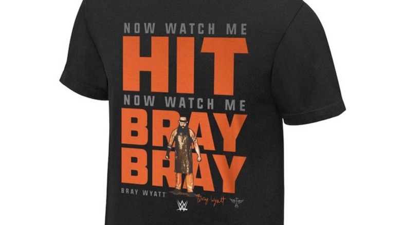
Thankfully, this Bray Wyatt shirt never saw the light of day. A WWE Shop tracker account on Twitter caught wind of the design and showed this monstrosity to the masses. The ensuing backlash was enough for WWE to pull the look almost immediately.
This shirt belongs in a box marked "What the heck were they thinking?" You remember Bray Wyatt back then, right? He was a cult-like leader from the swamps leading a small group of deranged followers known as the Wyatt Family. There is no reason whatsoever for that group and that rendition of Bray Wyatt to be associated with traditional pop culture, but that's what this shirt tried to do anyway.
The shirt is trying to reference the song "Watch Me" by rapper Silentó. The song's earworm chorus were: "Now watch me whip, Now watch me nae-nae, Now watch me whip, whip, Watch me nae-nae." Now re-read the shirt and try putting it to that beat with all you know about Bray Wyatt in mind. Ouch.
The hope is that nobody would have ever purchased this item if it was released; luckily, we'll never have to know for sure.